PROCESS (Programs, Tools, Skills, FOCUS principles)
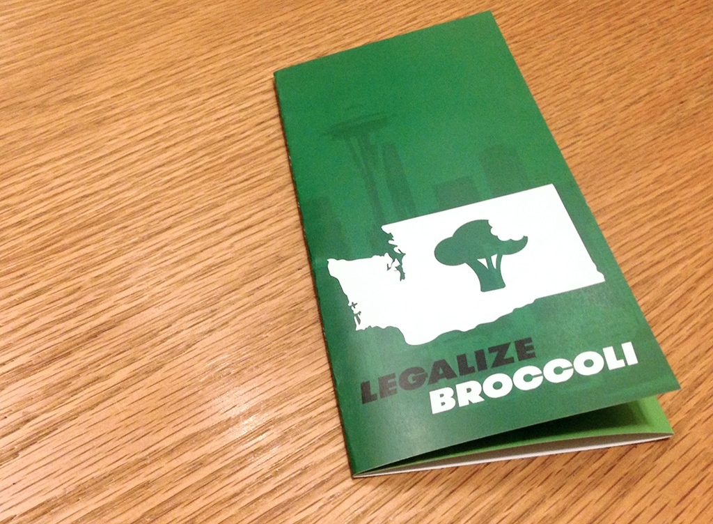
After a conversation with my sister sparked the fires of inspiration, I began the process of my design by creating a logo in Illustrator for the fake movement to “Legalize Broccoli”. In Illustrator I took a vector outline of Washington state I found online and subtracted a custom shape of broccoli from it. It was also in this phase that I settled on an emerald shade of green as the primary color of my design.
Next, I took a 8.5 x 11 piece of paper and folded it into a trifold brochure. I labeled the different faces of the folded paper and then unfolded the piece of paper as a template for how I should layout my brochure in InDesign.
The next part of the design process, and dare I say the longest, was to brainstorm with relatives and close friends jokes that I could put within my brochure. Many of the elements that ended up in my final draft are a result of these brainstorming sessions.
CRITIQUE PROCESS
One-on-One Critique: Jacob Instructor Critique: My teacher made some suggestions to fix the tracking of my text and to increase the contrast of my heading text from the main body. I made the adjustments and I will admit that the final product looks much better because of the suggestions made.
MESSAGE
Broccoli is an often misunderstood vegetable.
AUDIENCE
Those who enjoy irony, satire, and the occasional bit of dry humor.
TOP THING LEARNED
The design process is more enjoyable when you have people to throw ideas at and bounce jokes off of.
COLOR SCHEME & COLOR NAMES
Monochromatic // Green
TITLE FONT NAME & CATEGORY
Roboto // Sans Serif
COPY FONT NAME & CATEGORY
Roboto // Sans Serif
- Tools Used
- Adobe Photoshop, Adobe Illustrator