To improve myself as a designer, I've decided to participate in a set of "14-day design challenges" that ask me to produce client-worthy work from scratch every 14 days.
My first challenge was to create an icon set based on a theme of my choosing.
The Making of an Icon
The first step was picking an icon theme centered around something for which I have passion.
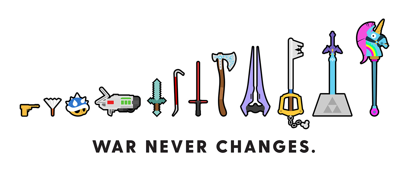
Growing up in the gloomy Seattle area, much of my youth was spent avoiding rain and playing video games with my brother. I decided to create an icon set featuring signature weapons from famous video game franchises and began making quite the list.
After the heart-wrenching process of narrowing my list down to 12, I knew I would need to create some rules to help the icons feel cohesive as a set. The video game weapons I chose came from a variety of consoles generations, had very different art styles, and some of the games were very pixelated.
I created the following rules:
- Keep the icons as "flat" as possible. Avoid excessive light, shadow, and detail.
- Keep the colors consistent as much as possible. Use the HSB color model to create shades of core colors.
- No gradients
- No Illustrator effects
- Create a sizeable black outline around the completed shapes. The stroke has round caps and joins.
- No textures
- Weapons would all point to the right (this one was added later on)
- View weapons from the same perspective
Sketches
I got out some paper and wrote down my list of weapons for reference. I began drawing each weapon, looking at reference material from different angles to help me determine the signature features to include.
This sketching process proved valuable as it helped me manifest my ideas quickly, without having to spend any time in Illustrator. I was also able to scan the sketches and use them as a reference layer when I eventually went in and started making them in Illustrator.
- Tools Used
- [Illustrator]